Why it works for weddings
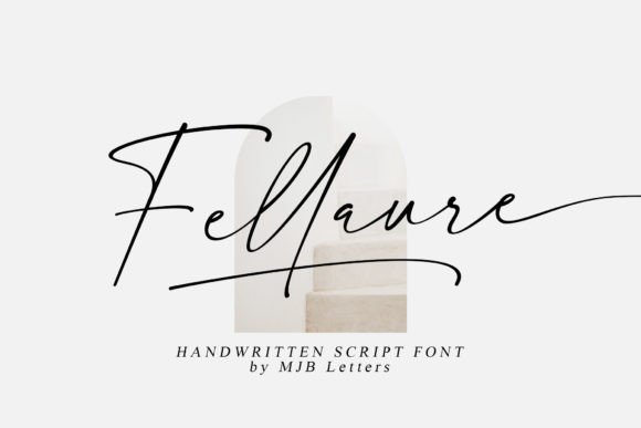
Magazine-style stationery depends on contrast between one expressive element and calm, disciplined type. Fellaure supplies the expression; a strict grid and a quiet palette supply the discipline.
Where to use it
Invitation names
One or two lines, large, with a hairline rule below.
Menu and programme titles
Titles only; keep body text in a serif.
Cover of a vow book
A short title feels personal and refined.
Styling recipe
A starting point for a balanced layout. Adjust to your wording, and confirm with a proof.
- Pair with
- Garamond or a similar refined serif
- Size
- Names large; labels in small capitals
- Colour
- Bone, soft black and one accent such as sage
- Paper
- Smooth cotton or matte stock
Common mistake: Filling every corner
Editorial layouts rely on space. Remove an element before adding one.
Questions
Formal or casual?
Between the two: polished enough for formal events, relaxed enough for modern ones.
Can I mix it with another script?
Better not. A serif or sans-serif partner keeps the hierarchy clear.
Ready to try Fellaure?
Check the full glyph set, licence and previews on the product page.
View on Creative Fabrica