Why it works for weddings
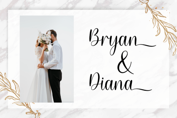
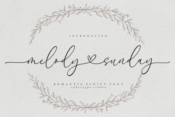
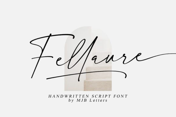
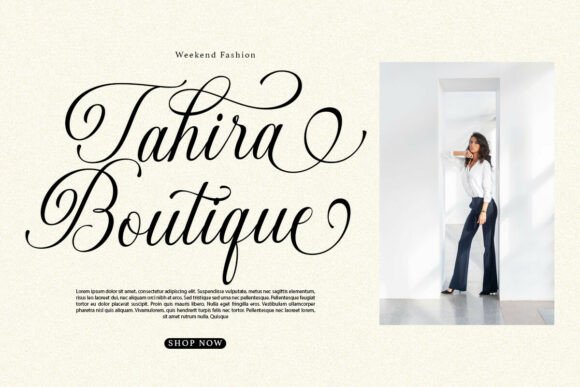
Formal etiquette depends on rhythm: short centred lines, generous space and restrained capitalisation. A formal script supports that rhythm instead of competing with it, so even a digitally printed card reads as dignified.
Where to use it
Main invitation
Set the couple's names as the largest line and keep every other line quiet.
Ceremony programme
Use it for the cover title and section headings only.
Framed certificate or sign
A single formal line, such as the date, looks refined on a keepsake print.
Styling recipe
A starting point for a balanced layout. Adjust to your wording, and confirm with a proof.
- Pair with
- A classic serif, in small capitals for supporting lines
- Size
- Names roughly three times the size of the date line; confirm with a proof
- Colour
- Navy, charcoal or black on ivory
- Paper
- Heavy ivory or cotton stock
Common mistake: Mixing numerals and spelled-out words
In a formal suite, choose one convention. Spelling out the date and time is the traditional choice.
Questions
Can formal script carry modern wording?
Yes. Warm, simple wording in a formal script looks elegant rather than stiff.
How small can it go?
Script needs size to stay legible. Keep it for names and headings and set details in a serif.
Ready to try Gastonia Script?
Check the full glyph set, licence and previews on the product page.
View on Creative Fabrica