Why it works for weddings
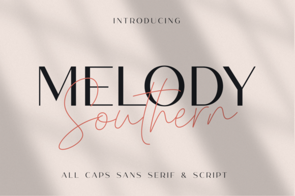
The usual risk with two fonts is giving them the same job. Give one a display role and the other a supporting role, and the suite gains contrast without a third typeface.
Where to use it
Invitation suite
Display style for names, support style for details.
Welcome sign
A short gracious line.
Menu
Title in display style, dishes in support style.
Styling recipe
A starting point for a balanced layout. Adjust to your wording, and confirm with a proof.
- Pair with
- Itself, plus a plain serif for fine print
- Size
- Never use both styles at the same size on one line
- Colour
- Magnolia, sage, peach and porch green
- Rule
- Resist adding a third typeface
Common mistake: Giving both fonts the same job
Assign roles: display and support.
Questions
What is in a font duo?
Typically two coordinated styles; check the product page.
Is it only for Southern weddings?
No; the warm tone suits any gracious wedding.
Ready to try Melody Southern Duo?
Check the full glyph set, licence and previews on the product page.
View on Creative Fabrica