Why it works for weddings
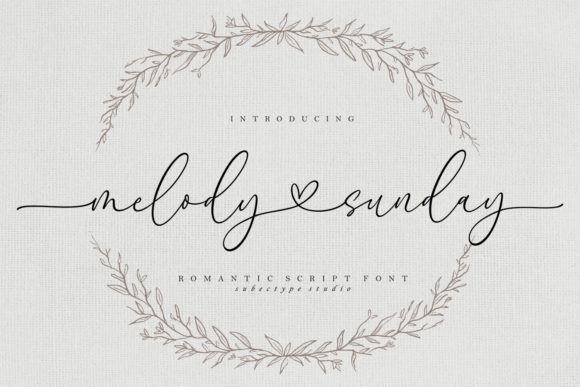
Calligraphy with long, graceful strokes needs margin more than decoration. When those strokes have space, they lead the eye across the card and the design feels intentional.
Where to use it
Main invitation
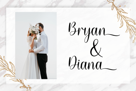
Names large and centred, with nothing crowding the strokes.
Welcome sign
One word or the couple's names, as large as the board allows.
Envelope liner or seal
Initials or a short word for a finishing flourish.
Styling recipe
A starting point for a balanced layout. Adjust to your wording, and confirm with a proof.
- Pair with
- Small serif capitals with wide tracking
- Size
- Names largest; every other line at least half the size
- Colour
- Ivory ground with navy or rose-gold ink
- Paper
- Cotton stock; foil or letterpress if budget allows
Common mistake: Placing ornaments against the strokes
Keep borders and motifs clear of the lettering so every stroke can finish cleanly.
Questions
Will long strokes be trimmed at the edge?
They can be if they sit too close. Keep generous margins and follow your printer's safe zone.
Is it suitable for small cards?
It can work, but it needs space. Choose a larger card or shorter names.
Ready to try Melody Sunday?
Check the full glyph set, licence and previews on the product page.
View on Creative Fabrica