Why it works for weddings
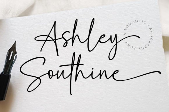
Guests respond to stationery that looks human. A handwritten script with natural rhythm signals care without the stiffness of formal calligraphy, so it suits both classic cards and relaxed garden invitations.
Where to use it
Main invitation
Names large, with the rest of the card kept calm.
Place cards
One name per card keeps the hand-penned effect crisp.
Thank-you notes
A short line in script feels like a personal reply.
Styling recipe
A starting point for a balanced layout. Adjust to your wording, and confirm with a proof.
- Pair with
- Spaced uppercase sans-serif for date and venue
- Size
- Names at least three times the body size
- Colour
- Charcoal or deep brown on ivory
- Paper
- Smooth matte or lightly textured cotton
Common mistake: Setting script in capitals
Connected letterforms need lowercase to flow. Use sentence case.
Questions
Can I set a full paragraph in it?
Better not. Use it for names and short phrases, and a simple serif for longer text.
What ink colour flatters it?
Deep brown or charcoal; pale greys weaken thin strokes.
Ready to try Ashley Southine?
Check the full glyph set, licence and previews on the product page.
View on Creative Fabrica