Why it works for weddings
A wedding looks designed when one mark appears everywhere, on the invitation, the sign and the favour. Building that mark early, in one lettering style, saves decisions later and makes every piece feel related.
Where to use it
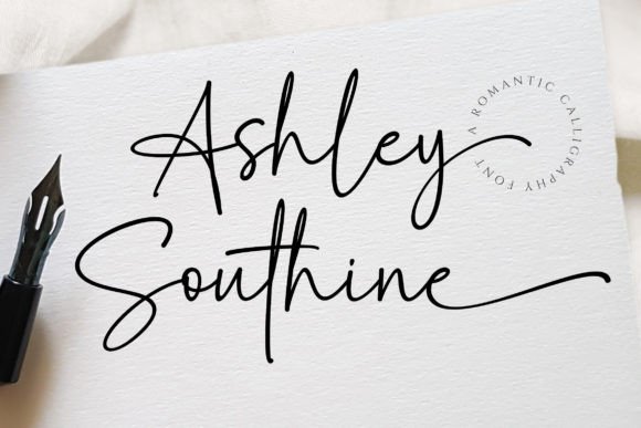
Couple lockup
Names with an ampersand, inline or stacked.
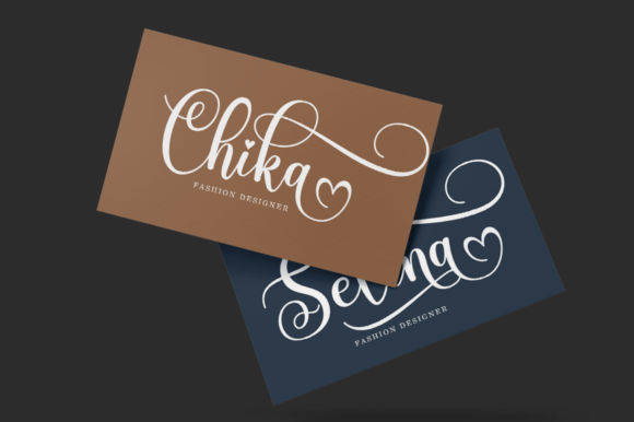
Monogram or seal
Initials in the same script for stickers and wax-style seals.
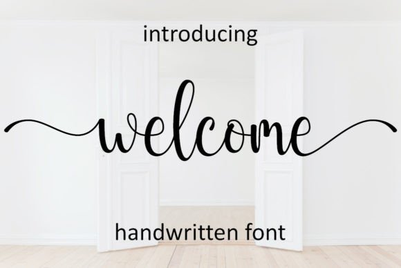
Signage
The same lockup on the welcome sign and the bar menu.
Styling recipe
A starting point for a balanced layout. Adjust to your wording, and confirm with a proof.
- Pair with
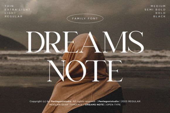
- Thin uppercase sans-serif for the date line
- Size
- Balance a long and a short name with size or a stacked layout
- Colour
- Soft white, ink and one muted accent
- Files
- Save a master in dark and light versions
Common mistake: Ignoring letter collisions
Check capitals and descenders for every name pair and nudge spacing where needed.
Questions
Should the date be part of the lockup?
Optional. Names alone are more flexible; adding the date makes the lockup more specific.
Can initials stand alone?
Yes, for small items such as seals and napkins.
Ready to try Joseph Sophia?
Check the full glyph set, licence and previews on the product page.
View on Creative Fabrica