Why it works for weddings
Playfulness works when it is deliberate: one bright colour, one lively font and plenty of space. Five competing motifs look chaotic; one looks charming.
Where to use it
Shower invitation
Honouree's name large in the hero colour.
Kids' activity pack
A lettered title and short instructions.
Garden-party signs
A few words each.
Styling recipe
A starting point for a balanced layout. Adjust to your wording, and confirm with a proof.
- Pair with
- A rounded sans-serif
- Size
- Larger type for anything children read
- Colour
- Poppy red, soft black, leaf green, cream
- Limit
- Three colours including the neutral
Common mistake: Too many motifs
Pick one small illustration and leave the rest quiet.
Questions
Can it work on a main invitation?
If the wedding is relaxed. For formal events, keep it for the surrounding parties.
How many colours should I use?
Three is comfortable.
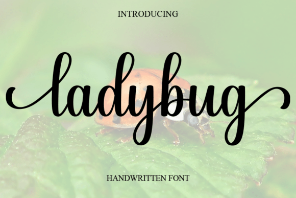
Ready to try Ladybug?
Check the full glyph set, licence and previews on the product page.
View on Creative Fabrica