Why it works for weddings
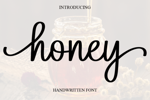
Colour temperature sets mood fastest. Cream paper, amber accents and deep brown text make a card feel like the evening itself, and a warm script keeps that feeling consistent.
Where to use it
Autumn invitation
Names in deep brown, one amber accent.
Favour tags
A short thank-you on a jar of honey or preserves.
Signature cocktail sign
The name in script, ingredients in plain type.
Styling recipe
A starting point for a balanced layout. Adjust to your wording, and confirm with a proof.
- Pair with
- A soft serif
- Size
- Names large; labels in small spaced capitals
- Colour
- Oat cream, amber, deep brown and olive
- Paper
- Uncoated cream or lightly textured stock
Common mistake: Pale amber for small text
Use deep brown for small text and reserve amber for one large accent.
Questions
Does it suit spring weddings?
Yes; swap the supporting palette for sage and ivory.
Which finish suits warm tones?
Uncoated or matte; gloss flattens warm colour.
Ready to try Honey?
Check the full glyph set, licence and previews on the product page.
View on Creative Fabrica