Why it works for weddings
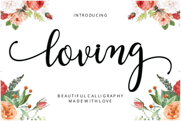
When the lettering already carries this much personality, the rest of the design can stay simple. Florals in the corners, calm space in the middle and dark ink make it feel storybook rather than busy.
Where to use it
Floral invitation
Names large over a calm centre.
Gift tags and cards
A short thank-you in script.
Welcome sign
Deep green or charcoal lettering against flowers.
Styling recipe
A starting point for a balanced layout. Adjust to your wording, and confirm with a proof.
- Pair with
- A light sans-serif such as Lato
- Size
- Names large; details small and centred
- Colour
- Blush, peony, leaf green, cream
- Layout
- Florals in corners; keep the text field clear
Common mistake: Pale pink script on a pale background
Choose dark ink for names so they do not disappear.
Questions
Does it suit formal weddings?
Sparingly: names only, with a classic serif.
Can I use white on a dark card?
Yes, with a larger size and a test print.
Ready to try Loving?
Check the full glyph set, licence and previews on the product page.
View on Creative Fabrica