Why it works for weddings
Guests read reception stationery while standing, hungry and looking for their table. Script is lovely for titles, but names and dishes read faster in plain type, so the best layouts use both.
Where to use it
Menu card
Title in script, courses in small capitals, dishes in a serif.
Table numbers
A single large numeral or one short word.
Seating chart
Script for the heading, a clear sans-serif for names.
Styling recipe
A starting point for a balanced layout. Adjust to your wording, and confirm with a proof.
- Pair with
- A serif in small capitals
- Size
- Names on a seating chart large enough to read standing
- Colour
- Linen, slate and soft sage
- Order
- Sort seating alphabetically by guest name
Common mistake: Unchecked guest names
Proofread every name against the final list with a second person.
Questions
Should the whole seating chart be script?
No. Use script for the title and plain type for names.
How long should menu descriptions be?
Short: the dish and one or two key ingredients.
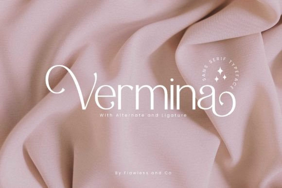
Ready to try Vermina?
Check the full glyph set, licence and previews on the product page.
View on Creative Fabrica