Why it works for weddings
City venues already have a strong identity: concrete, glass, metal. Stationery that borrows one of those materials and aligns to a clear grid feels as if it belongs to the place.
Where to use it
Invitation
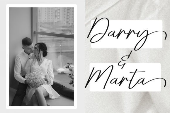
Names large and left-aligned, details stacked beneath.
Welcome sign
A single word with a thin rule.
Arrival card
Entrance, floor and transport notes in plain type.
Styling recipe
A starting point for a balanced layout. Adjust to your wording, and confirm with a proof.
- Pair with
- A geometric sans-serif
- Size
- Names large; details small and aligned to one edge
- Colour
- Concrete, warm white, charcoal and one metallic
- Extras
- A tested QR code linking to a map or wedding website
Common mistake: Forgetting arrival details
City venues confuse guests. Add the entrance, floor and transit notes.
Questions
Can a script feel modern?
Yes, when it sits in a strict layout with ample space and a clean sans-serif.
Does it work for a daytime wedding?
Yes. Swap copper for soft gold and use lighter greys.
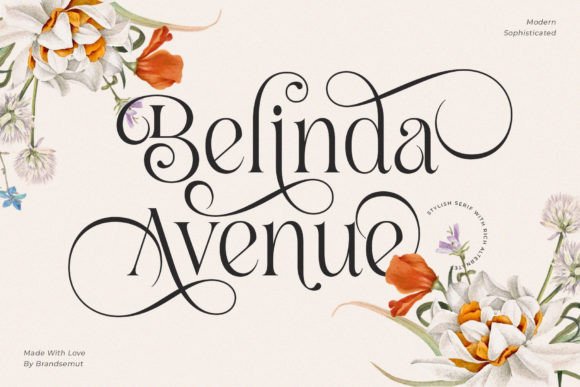
Ready to try Belinda Avenue?
Check the full glyph set, licence and previews on the product page.
View on Creative Fabrica