Why it works for weddings
Flowers and type compete for the same space. Plan the text area first, then arrange the artwork around it, and the florals frame the lettering instead of covering it.
Where to use it
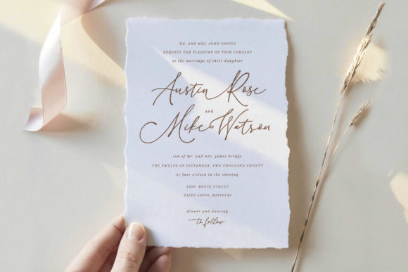
Floral invitation
Names in the display style inside a safe area.
Menus and signs
Colours pulled from the bouquet.
Programmes
Floral corner and calm text field.
Styling recipe
A starting point for a balanced layout. Adjust to your wording, and confirm with a proof.
- Pair with
- Itself; dark neutral for body text
- Size
- Roughly 40 percent artwork, 60 percent calm space
- Colour
- Three colours from the bridal bouquet
- High-resolution art with about 3 mm bleed
Common mistake: Pale text on pastel flowers
Keep the main text in a dark neutral.
Questions
Do I need bleed?
If artwork reaches the edge, yes; about 3 mm is common, but check with your printer.
Should I order a proof?
Yes; soft watercolours can shift in print.
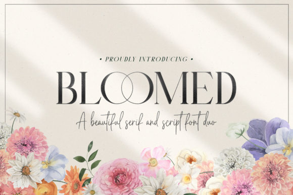
Ready to try Bloomed Duo?
Check the full glyph set, licence and previews on the product page.
View on Creative Fabrica