Why it works for weddings
The save-the-date sets expectations, so it should be warm, clear and brief. A romantic script on a calm photo or plain colour gives the date the attention it needs.
Where to use it
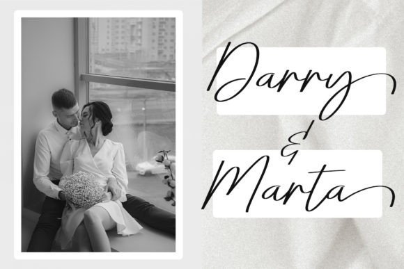
Photo save-the-date
Names over a calm area of the picture.
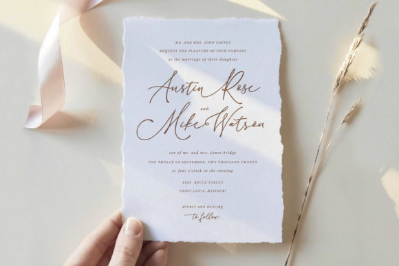
Typographic card
Names and date on a coloured ground.
Digital announcement
A shareable image for international guests.
Styling recipe
A starting point for a balanced layout. Adjust to your wording, and confirm with a proof.
- Pair with
- A light sans-serif for the date
- Size
- Date in clear type, not script numerals
- Colour
- Petal pink, rose and warm grey
- Timing
- Roughly six to eight months before, earlier for destination weddings
Common mistake: Text over a busy photo
Choose a calm area or add a soft colour panel behind the lettering.
Questions
Do I need a photo?
No; a typographic card is elegant and easy.
What if details are not final?
Share the date and city and send full information with the invitation.
Ready to try Lovely?
Check the full glyph set, licence and previews on the product page.
View on Creative Fabrica