Why it works for weddings
The morning is crowded with people, flowers and nerves. Soft lettering, neutral colour and a clear schedule give the eye somewhere to rest and the day a calm start.
Where to use it
Timeline card
Times in a clear serif, activities beside them.
Robe tags
One name each, lettered consistently.
Welcome note
A short greeting for the suite door.
Styling recipe
A starting point for a balanced layout. Adjust to your wording, and confirm with a proof.
- Pair with
- A light serif
- Size
- Times larger than activities for fast scanning
- Colour
- Linen, dusty sage and warm taupe
- Paper
- Soft matte stock
Common mistake: A timeline with no hierarchy
Make the times the largest text so people can find their slot at a glance.
Questions
Do I need a timeline card?
It is one of the most practical pieces, for guests and for the photographer.
Can it match the invitation?
Yes, with the same palette and softer neutral accents.
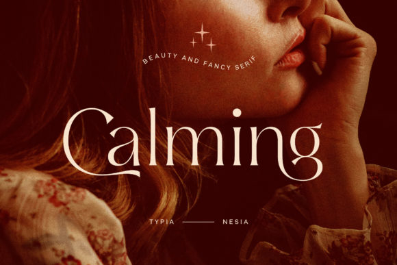
Ready to try Calming?
Check the full glyph set, licence and previews on the product page.
View on Creative Fabrica