Why it works for weddings
A layout that looks perfect on screen can disappear in full sun. Dark ink on a pale matte surface, a few large words and a stable stand will do more for legibility than any amount of decoration.
Where to use it
Welcome board
Names and date only, set as large as possible.
Directional signs
One word each with an arrow.
Programme cards
Held in the hand, so smaller type is fine.
Styling recipe
A starting point for a balanced layout. Adjust to your wording, and confirm with a proof.
- Pair with
- A simple sans-serif for schedules
- Size
- Roughly one inch of letter height per ten feet of viewing distance, plus extra for script
- Colour
- Deep slate on warm white
- Surface
- Rigid matte board, weighted against wind
Common mistake: Pale ink on a pale ground
Soft yellows and blues are for borders. Use dark ink for the lettering.
Questions
What material suits outdoor signs?
Rigid matte surfaces such as foam board, wood or acrylic with a non-reflective finish.
Does it work indoors?
Yes, for any bright room.
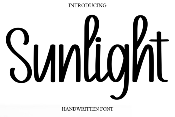
Ready to try Sunlight?
Check the full glyph set, licence and previews on the product page.
View on Creative Fabrica