Why it works for weddings
Casual does not mean careless. A friendly font looks intentional when sizes, spacing and colours stay consistent from the invitation to the signage.
Where to use it
Welcome sign
Names and date in large lettering.
Itinerary headings
Headings in the font, times in a sans-serif.
Bar and food signs
One or two friendly words each.
Styling recipe
A starting point for a balanced layout. Adjust to your wording, and confirm with a proof.
- Pair with
- A clean modern sans-serif
- Size
- Sign words large; keep each sign to a few words
- Colour
- Meadow green, buttercream and chalk white
- Case
- Lowercase or sentence case reads best
Common mistake: Pastel on pastel
Use dark ink on light boards so signs read from a distance.
Questions
Is it suitable for invitations?
Yes, for casual or garden weddings; set dates and addresses in plain type.
Does it work in capitals?
Lowercase keeps the friendly handwritten feel.
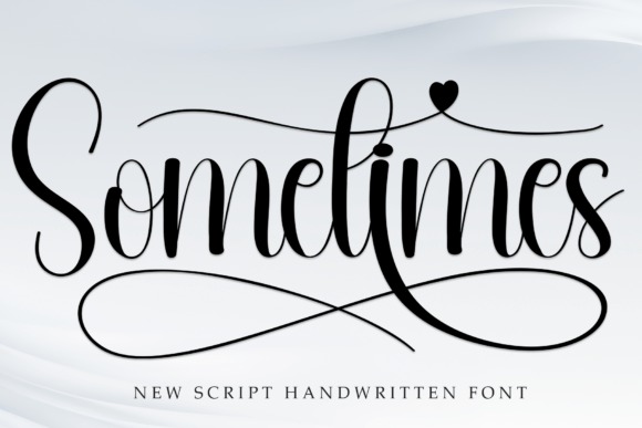
Ready to try Sometimes?
Check the full glyph set, licence and previews on the product page.
View on Creative Fabrica