Why it works for weddings
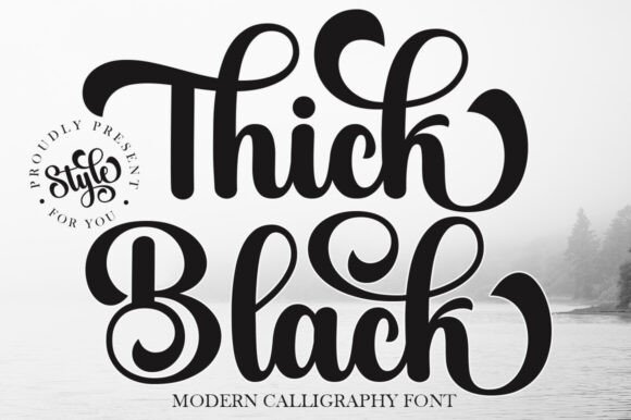
Heavy lettering needs almost no decoration. It reads across a room, photographs well and tolerates dim venues and busy backgrounds, so it is a practical choice as well as a stylish one.
Where to use it
Welcome sign
One word, as large as the board allows.
Bar and drinks sign
Two or three words with a thin supporting line.
Gallery-style poster
Names and date only, on a clean ground.
Styling recipe
A starting point for a balanced layout. Adjust to your wording, and confirm with a proof.
- Pair with
- Thin uppercase sans-serif
- Size
- Keep each sign to three words or fewer
- Colour
- Black, white and one earthy accent
- Surface
- Matte board or paper to avoid glare
Common mistake: Adding more elements
Every extra line weakens a bold statement. Stop early.
Questions
Is bold too heavy for a romantic wedding?
Not if you pair it with space and a light supporting font.
Can it be used for body text?
No. Keep it for short headlines.
Ready to try Thick Black?
Check the full glyph set, licence and previews on the product page.
View on Creative Fabrica