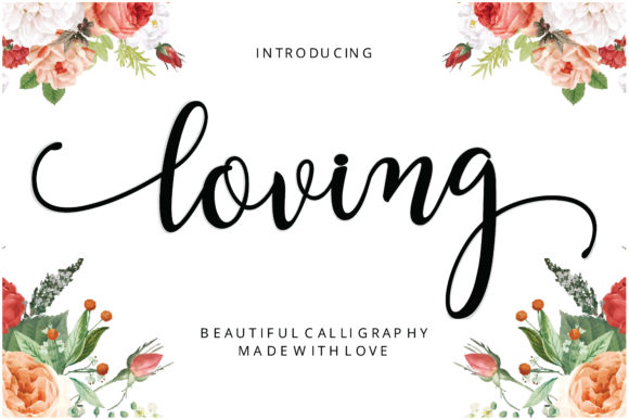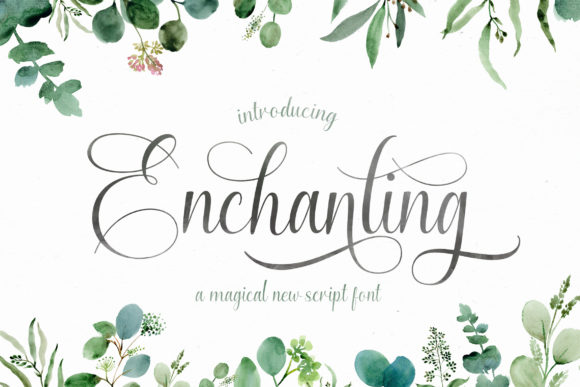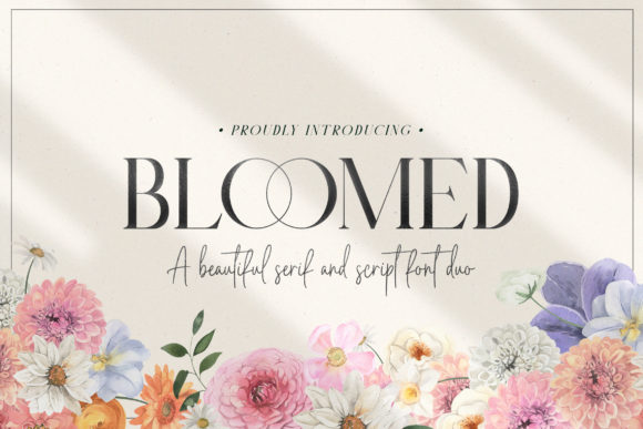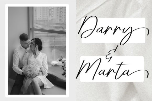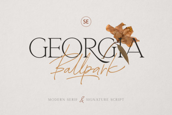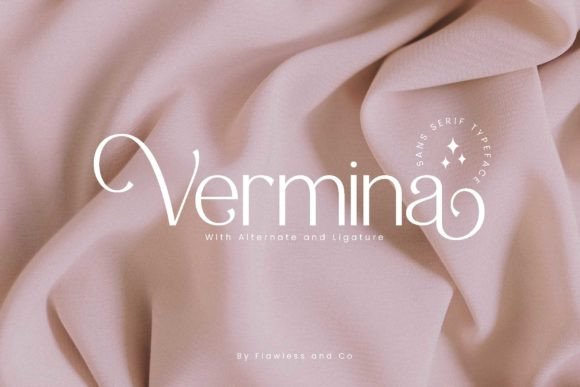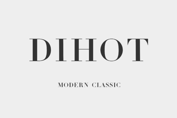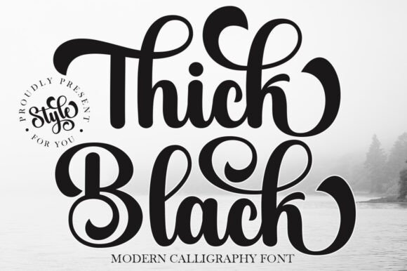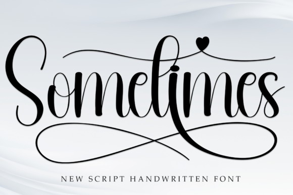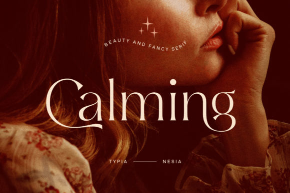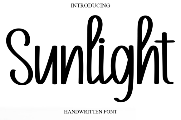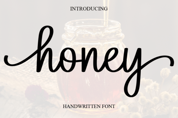
Formal Calligraphy · No. 01
Gastonia Script
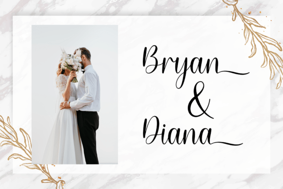
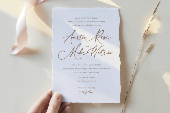
A formal script for traditional wording and symmetrical layouts.
Curated wedding typography
Thirty-one hand-picked scripts and calligraphy fonts, each with practical pairing, sizing and paper notes, so you can choose with confidence and design with ease.
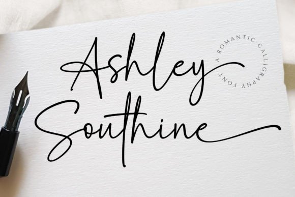
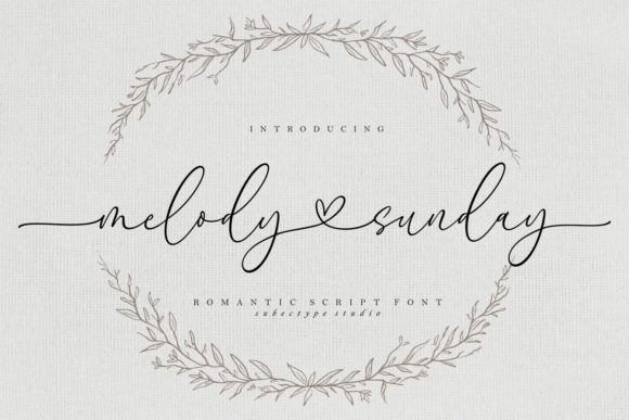
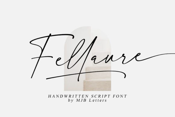
Collections
Six collections group the fonts by tone, so you can jump straight to the style that fits your day.
Ceremonial scripts for traditional wording, vow books and evening stationery.
Explore →7 fontsWarm, pen-written fonts for names, notes and cards that should feel personal.
Explore →5 fontsSoft, flowing lettering for invitations with a storybook or garden mood.
Explore →5 fontsClean, current fonts for wedding websites, signage and photographer branding.
Explore →4 fontsHeavier, confident fonts for headlines, signs and monograms.
Explore →4 fontsLight-hearted lettering for showers, favours and relaxed celebrations.
Explore →Catalogue
Filter by collection, or search by name. Each card opens a full guide with a ready-made styling recipe.
Showing 31 of 31 fonts
A formal script for traditional wording and symmetrical layouts.
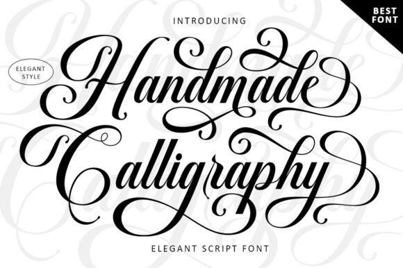
A hand-lettered feel for envelopes and place cards.
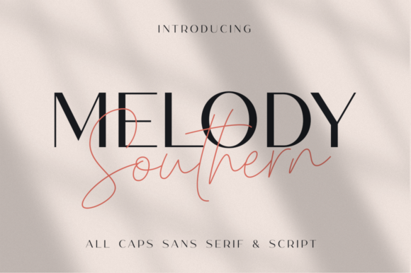
A coordinated font duo for hospitable, Southern-style suites.
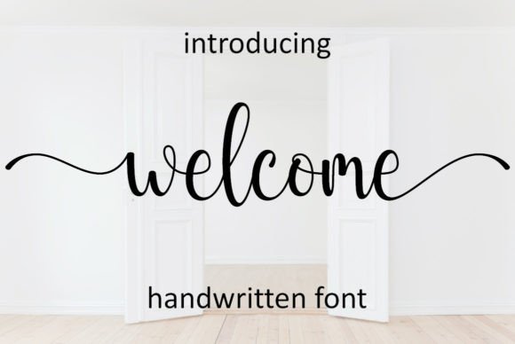
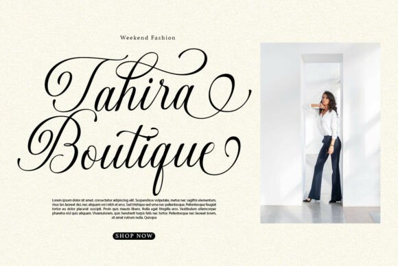
A chic script for rooftop, loft and boutique-hotel weddings.
A brand-ready script for planners and stationery studios.
No fonts match your search. Try a shorter word or choose another collection.
How to choose
Traditional wording calls for a formal script and a classic serif. Relaxed wording lets you use handwriting.
Pick a single expressive script for the names. Everything else should support it quietly.
Fine strokes behave differently in print, foil and on screen. Always order a proof.
Pairing rules
Want the full method? Read the font pairing guide.
The dependable pairing: expressive names, readable details.
A modern look. Use capitals with wide letter spacing.
Two competing scripts muddy the hierarchy. Keep a single hero.
Make names clearly larger than everything else so the hierarchy reads instantly.
FAQ
Start with the formality of your wording, then pick one expressive script for the names and a quiet serif or sans-serif for details. Always check a printed proof.
Licence terms differ by product. Read the licence on each Creative Fabrica page before using a font commercially or for client work.
Two is the safe number: one script for names and headings, one plain font for details. A third should be a deliberate accent.
Installed fonts are available in most design tools, but app support differs, so test a sample line before committing.
Every font links to its Creative Fabrica page, where you can check glyphs, licences and live previews.
Browse Creative Fabrica